Question 1. In what ways does your media product use, develop or challenge forms and conventions of real media products?
In the research and planning stages of constructing an overall brand and concept for our music video I was able to identify common alternative/mainstream pop conventions that are widely used in the industry today. I was able to research these conventions in depth by viewing music videos that was aimed at the same, if not similar, target market. As our chosen song both suited the alternative pop music genre as well as mainstream pop it was important to incorporate conventions of each style individually. Arguably, the differences in conventions of mainstream pop minor in comparison to alternative pop can sometimes be minor or no different at all. Although I researched both genre types in order to give me the opportunity to match which would be most appropriate for my song. Within my media products there were of course conventions that could be challenged, however I did not directly challenge any conventions but merely adapted some in order to reinforce the innovative and unique image of my music artist.
I believe it is important to note that most conventions I came across were not used unnecessarily, but used across the board as they are successful in capturing the attention of their intended target market. Therefore by developing these conventions I was able to retain this successful strategy without diverting my intended audience from my brand I was trying to promote.
Digipak & Album Advert Graphic Design
An effective convention I complied with was the use of a house style to show a consistent graphic design appearance between my digipak and album advert. Texts that I had analysed previously, such as Katy Perry's 'Teenage Dream' album, followed a particular colour palette, typography and layout style. For example, the type face for 'Teenage Dream' title on the cover of the digipak is then used in capitals on the back with a different colour. I developed this convention with my own, however I only used one type face which I adapted into different styles for my logo, album title and then track listing:

For the track listing, I decided not to feature any capital letters at all, in comparison to Katy Perry's capitalised listing. This was because I wanted my back cover to be as basic as possible. Also, because I had already capitalised the 'G' in 'Ghosts' on the digipak cover I thought the audience would then be able to distinguish the importance of the album title in contrast with the track lisiting. To attract the attention of the audience I then added several effects to the logo 'Lexi and the Spectrum' in the same font. I used a white outer glow, with drop shadow and my key colour, coral pink, as the fill. I was originally inspired by Katy Perry's logo on the cover, but decided not to use an inner shadow like Katy's as I did not want a 3D appearance of a bubble - although I did want it to 'pop' out from the page which the shadow provided.
This convention that I followed was the use of a logo for my artist, which is vital in creating so that it can carry connotations of their music but also so that is becomes a symbol for their act. I did this by using an obscure font, that was thick and bold, and edited properties such as shadowing and adding an outer glow. I did this because it was more eye-catching than a basic used black font, but also because I found that in the pop genre the logo was important on the cover of products such as the digipak to promote themselves. In the pop genre the typography is always more advanced, with the adopting of a sans serif font the most popular to avoid appearing too classical and "high brow".
 |
| Main logo |
 |
| Katy Perry's logo, with blue outer glow and inner white shadow to give that bubble effect |
I then took inspiration from her digipak to to create my own house style that could be associated with my artist.
 |
| Katy Perry's 'Teenage Dream' Digipak |
I used a main vibrant colour of coral red alongside two other complimenting colours or a dark grey and cream. By focusing on one central vibrant colour this can create a cognitive model with the general public which I thought is vital in launching a new artist. I used this convention as it enables the audience's attention to focus on my digipak rather than any others.
Using bright colours is a typical convention of the pop genre, the artist to be perceived as exciting and playful which the audience likes to be associated with. This was clear in my research, for example I found indie and rock genres had dark colour combinations whereas pop genres used bright combinations to reflect the mood of the genres.
INDIE/ROCK GENRES EXAMPLES: (Left, Noah and the Whale's 'First Day of Spring, Centre, Mumford & Sons' 'Sigh No More', Right, ACDC's 'Highway to Hell')
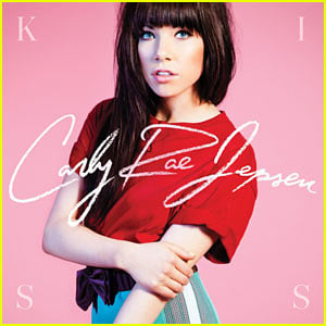
POP GENRE EXAMPLES: (Left, Carly Rae Jepsen's 'Kiss', Centre, Maroon 5 'Overexposed', Right, Rihanna's 'Loud'
The visual difference of colour use is different from indie/rock to pop. Therefore, as my artist was pop/alternative pop I required the majority of bright colours to enhance the style of music being marketed. I also adhered to the social stereotype of using a pink colour with my female artist; I did this intentionally as it would enhance the sexuality of my artist and reflect her femininity. This can also be seen used in real media products, such as in Rihanna's 'Loud' and Carly Rae Jepsen's 'Kiss', above, therefore by adopting this convention I wanted to achieve the look of a real media product that could be proposed for a female artist.
 |
| The use of pink is consistent throughout |
On the other hand, I did challenge the typical convention of using photographs on my digipak and album cover instead I opted for using sketches to represent my artist. This is because I felt I could reflect the 1950s style more effectively if I drew it, rather than using a high mega-pixel camera that would not be comparable to the era.
Also, I decided to use sketches which is a common convention of the indie genre because it is used to explore the creativity or underlying meaning of the artist or song. For example, the Foals Antidotes album cover here is a hand drawn image with the central man looking solemn; the multicoloured technique on his mouth can be interpreted in several ways by their audience. Perhaps it suggests a silence the star is feeling. Whichever way, I thought that by using a sketch it allowed the underlying meaning of the digipak/album cover to be openly interpreted by the audience.
 |
| Foals Antidotes Cover |
I made sure that within my illustrations that it did not resemble the artist entirely so I could create a 50s style illustration but still used features from my artist's face. This may not be as an effective option to take, especially as my artist is still launching her career, but I thought the 50s style could be easily represented this way. In this way I went against the conventions of generic pop covers as the artist is normally easily recognise in order to build their profile. This is similar to Foals' 'Antidotes' Cover, as I believe the lead singer may have been manipulated to be portrayed in a fine-art look. This is effective for their indie genre as it adds to their quirky indie music, but also draw in fans that are attracted by this. I was inspired by the way the sketch appeared on the Foals Antidotes cover, so I decided to develop my own style and overlay my own sketch on Photoshop onto a similar light cream background. I thought that this background colour was also similar to the posters I had researched from the 1950s, and in this sense I went against the conventions of modern day real media products by taking inspiration from historic texts such as these:
 |
| The light cream toned background makes the red pop from the page |
 |
| The cream background also compliments all other colours well |
These posters were the main inspiration for the background of my album advert as well. In terms of my album advert, I researched many album adverts to see the alternating concepts of typical conventions. For example, the presentation of the album title is vital. I took inspiration from Plan B's 'The Defamation of Strickland Banks' where the font was capitalised for the album title. I thought this was effective as it reinforced the importance and would then be one of the first features of the advert that the audience would see.
 |
| Plan B's album advert |
 |
| The capitalised font located at the bottom of my album advert |
I wanted to develop my album title further my featuring a strap band underneath of my key colour. I did not see this in any album adverts I had researched as they typically used the same font/style continued from their album cover to create a consistent house style. Therefore I think I went against the conventions of real media album adverts here.
I feautred the same illustration as was on my digipak cover as this is what I had seen in previous media products I had researched. It enables my audience to then quickly associate the marketing strategy of the album advert with the physical album if they ever saw it, and perhaps later urging them to buy it. This was the most obvious in Florence and the Machine's 'Lungs' album cover and album advert:
 |
| Florence and the Machine's album advert |
 |
| Album cover |
It is clear that both the album advert and album cover are clearly associated, using the same image, artist logo, with black background and white border. I tried to translate a similar feeling in my own to adhere to this typical convention of media products by using the same logo, image and colour:
 |
| My album advert |
|
| My digipak, with album cover on the bottom right |
The only way I developed this typical style was by adding a painted splatter behind the illustration and changing the album title font.
I did not find any pop covers that composed their album covers the same way in order to manipulate theirs significantly to appear different altogether. Although I took inspiration from Maroon 5's 'Overexposed' album cover, where they used illustrations but adhered to the bright colour conventions of their genre (above in the pop genre examples, centre). Therefore this real media product made me develop from a simplistic illustration to a bright, colourful and eye-catching illustration by adding colour in the lips for example and the polka dots:
 |
| The hints of colour adhere to the pop genre |
By maintaining features from the music video it allowed me to keep these similarities and create a new star image. I attempted to retain the primary red tone of the colour palette in my music video also through the lipstick, clothing and furniture. However, I went against the convention of connecting them obviously, by using the garden sequences it allowed autumn tones to be translated but give some visual differentiation. This was evident in the Marina & the Diamonds video "Primadonna" which switched between the garden and the house. However, consistant tones are still evident, such as with the pink dress vs the pink hat. I adopted this convention by maintaining the same colour lipstick, a bright red, and heavy make-up whilst using the same post-editing properties to create a harmonious look.
|
|
| Left image: Inside, Right image: outside |
In general I decreased the saturation of colours on the video filter which is unconventional for the pop genre which reinforces the bright and vivid tones to reflect the up-beat tempo.
Lighting
In terms of use of lighting this was most significant in my music video. I used two real lighting stands and features, such as a honeycomb light cover to create the spotlight effect, in order to keep up with real media products. This also enabled me to film in dark conditions, such as the garden sequences which were shot outside at night. It gave the location a brightness that would otherwise not have been achieved in just average daylight. This is typical of real media products as filming at night also involves professional lighting so that the video quality is not compromised.
In terms of lighting I had researched videos such as Lana Del Rey's 'Summertime Sadness' which used outside shots with a spotlight to portray the dark connotations of the song. Another shot in this video was the use of a lighting stand behind the artist so that it created a halo effect and allowed the audience to focus more centrally on the artist.
 |
| Halo effect behind Lana Del Rey |
 |
| Halo effect in my music video |
I decided to recreate this in my video by using the spotlight behind the artist in the outside location rather than in the studio setting like Lana's. I thought this gave my artist a more serious and desolate appearance that I wanted to achieve for the dark connotations of the song. In this way I adhered to the conventions of indie pop as the lighting was experimental and I did not just stick to a plain lit set.
Lighting was also important for the indoor shots to block out any natural light and try and recreate the same environment as a sound stage. My main inspiration for lighting for Marina and the Diamonds 'Primadonna' again as I wanted to have bold lighting to enhance the face of my artist and create a shadow so that it gave the shot some depth.
 |
| 'Primadonna' video, the lighting create a shadow |
 |
| Cross shadow in my music video |
I did this by using lighting stands from opposite 60 degree angles so that if my artist moved during filming both side of her face would be clearly visible. I also used a reflective umbrella which allowed me to stop any light from bouncing back on the white wall and keep my artist as lit up as possible. This is an industry standard technique and very conventional during the filming of many music videos. Although this technique is very basic, I achieved a similar convention to that of Marina's video therefore complying to the lighting appearance of real media products.
Post-editing
For post-editing I used the program Adobe Premiere Elements 8.0 which is accessible to the public and is a domestic editing software which has conventional features to that of industrial programs used for the editing of music videos. The post-editing stages is again a vital part of each process for my media products as well as conventional real ones. Within real media products they regularly post-edit in order to enhance the look of their artist but also because elements that are not present in reality can be inserted, such as objects or background scenes from a green screen.
In conventional generic pop videos the saturation of the colours is increased, including the brightness to make the shots stand out more. The saturation in some cases can be increased dramatically, however I challenged this by decreasing the saturation on my video. I did this because I thought it gave a more professional finish to the shots. I also decreased the brightness so that that features such as my artist's hair appeared darker and increased the contrast so that the lines between objects appeared sharper. This is a convention I wanted to adhere to as I wanted to make the locations, such as the garden more appealing and make my artist stand out more, enhancing her star image. I also added a black and white effect onto particular shots of my artists featured during the bridge of my song; therefore reinforcing to the audience that the beat and rhythm of the song is different in contrast to the chorus and main verses. I took inspiration again from Marina and the Diamonds' 'Primadonna' where the artist is shown with a black and white effect during a sequence of her staring out of a car window, portraying the solemn and slow mood of the bridge within that song.
 |
Top image: black & white with contrast effects
Middle: Contrast effects with no altered saturation
Bottom: Original raw footage with no effects |
 |
| Black and white shot in MATD's 'Primadonna' video |
However, I did develop the amount of usage of the black and white effect within my video as I chose to only use the shots continuously next to each other with none repeated after the bridge. Although within Marina's video the black and white shots are positioned alongside coloured shots to transition back to the verse, whereas I just stopped the effect instantly in a straight cut and different scene.
Within music videos a typical convention that is adopted is the use of fast cut shots during up-beat parts of the song and long cuts for slower sections of the song. I wanted to adhere to this convention as the chorus of my song is sung quickly by the artist with the slowest part of the song being the bridge. Therefore I took inspiration from Marina and the Diamonds' 'Primadonna' again where fast, out-take appearance shots are used during the chorus and slow shots were used for the bridge. I used the editing technique of black and white overlay on the scene I had used for the slow bridge within my chosen song to give it a distinct difference to my audience and also be defined more vividly from the fast chorus. By also filming an entire different scene this allowed me to show to the audience the shy and innocent side of artist. This post-editing technique is a common convention in many music videos so it was important I had the contrast of the colour against the black and white look; it also entertains the audience more by using a variety of techniques.
Mise-en-Scene
Mise-en-scene is probably one of the most important components in the use of real media products within music videos. Themes or styles can be adopted depending on the genre of music or the connotations of the song. The artist that I had researched during for my main pitch was Christina Aguilera whose videos always follow a specific route with her being dolled up for many of her up-beat songs. For example, Christina Aguilera's 'Ain't No Other Man' is a pop/jazz song so she is seen in glamorous outfits which all fit into a 1920s style that match each other with both use of white and red.
This was media product was relevant to my own as I was taking inspiration from 1950s so I could develop this in my own style for my artist. I decided to use the 1950s theme as I could easily portray this in the mise-en-scene and develop a star image for my artist that the audience will be able to recognise. Therefore I used a 1950s style knee-length dress with polka-dots to adhere to the conventions of the theme I had chosen.
 |
| Christina Aguilera's 1920s style is clear in her clothing and set which I needed to do |
I followed the conventions of real media products by using heavy make-up which include bright red lipstick and fake eyelashes. This is important as well because the lighting can also make the artist's face appear washed with their complexion more visible; so to appeal to the audience make-up is vital to make my artist appear aesthetically pleasing. I also used changed the hair of my artist several times, such as in Christina's video, using hair rollers and then changing to having her hair down to provide a variety of different looks for different scenes so the changes between shots are obvious. Then for different locations, such as the garden sequence her hair was down and curly; this is a typical convention in real media products and is clear in Christina Aguilera's video as she has long hair and fringe in one shot and then a curly up-do in another.
 |
| My artist with hair rollers in |
Within the shots above the use of props is also obvious, such as the headphones and 1920s microphones which suit the period of the video. However I developed this to match my video instead, therefore I decided to use a cigarette holder in the garden sequences to give a relaxed and glamorous approach. I could then use this prop alternately, from holding it, to inhaling a cigarette and then exhaling; adding interest to my artist's image like Christina Aguilera.
 |
Hair styling/Mise-en-scene: her hair is dowm
Top: shot inhaling
Bottom: Two shots later exhaling |
 |
| The cigarette holder (red version) that I used in my video |
Location is also vital in portraying my artist is a certain way. I decided to use two different locations and within these locations I would change the positioning and area for my artist to act in. These locations were the inside of a bedroom suite and for the outside it was a garden/patio area. In real media products it is typical for several locations to be explored, such as with Marina and the Diamond's 'Primadonna' where for her outside shots she is seen in a variety of places:
 |
Just a select few of locations in the 'Primadonna' video
Top left: outside, garden area
Top right: Inside, elaborate living space
Bottom left: chandeliers pulled down, ballroom area
Bottom right: In a car wash, retro car featured |
I decided to also develop this convention which inspired me to do the same. Consequently, I used the main garden seat as the centre point of the location, and then also changing to shots in front of a bush and then standing in the centre of the location with a light behind her. This variety adds interest to my artist as well as the music video as it gives the audience something new to look at. I followed this convention with my indoor shots, by incorporating a variety of furniture and props in the bedroom. For example, I changed from shots on the bed, to shots on a sofa, to shots of a single chair and to shots in front of a dressing table. This allowed my artist to play around and experiment with different styles of lip syncing whilst interacting with the props, such as the telephone, whilst in different available positions in the location.
 |
The locations including the outdoor and indoor shots,
and within them a variety of different angles and props could be used |
Shot types
The shots used in a music video can be adopted in order to represent different connotations within the genre category with is a typical convention in many real media products. My main inspiration was the mid-shot used in Marina and the Diamond's 'Primadonna' were the artist is placed centrally in the shot with the white background which emphasises the space around her. I decided to develop this in my music video by attempting to construct the same style. I continued with a mid-shot for a majority of the shots, as I thought this was the best in entertaining my audience by showing more of the lip syncing.
One shot I had also taken inspiration from a real media product was the extreme close-up of the artist's lips. This was a very dramatic shot and thought it would be effective in my own video, as I could tie it in with the dramatic mise-en-scene of the heavy make-up.
 |
| Close-up of Marina and the Diamond's lips in the beginning of her video |
I decided for my shots to zoom in further so that my artist's face nearly filled the frame. I thought this was more dramatic, especially on strong syllables in the lyrics, which I could incorporate throughout. This would also add to the key colour of strong red throughout and add to the colour pallette of my video. Therefore I adhered to the conventions of real media products in this sense by also emphasising the sexuality of my artist and making her the subject of the 'Male Gaze'.
 |
| Extreme close-up in my music video |
Another shot type I admired in Marina and the Diamond's 'Hollywood' video was the camera angled at a mid-shot at a 60 degree angle to show the artist singing in the mirror. This was important to also incorporate an over-the-shoulder shot so that the audience would recognise that the artist are singing in the mirror, otherwise it would not be known.
 |
| Marina and the Diamond's 'Hollywood' mirror shot |
I developed this into my video, however I decided it would work best if the artist's head fitted into the frame, unlike Marina's video. I think this worked well and would be similar to that of real media products.
 |
| Mirror shot in my music video |
I also experimented with the conventional mid-shot by placing my artist in the off-right third of the frame, going against the conventional central rule of third. I think this is effective as it makes the audience interact more visually with the frame and retain interest in the whereabouts of my artist.
 |
| Artist is not central, but this was an intentional feature for my shot types |
Another style of shot type I was intrigued by was the portrayal of amateur filmed shot types in comparison to the sturdy and level shot types filmed by a professional. I viewed this in my textual analysis of Lana Del Rey's 'National Anthem', showing a unlevel shot type which typically has more movement. Contextually, this also featured shots that appeared as if it were an out-take and unprepared; therefore I tried to capture this in the smiling shot of my artist:
 |
Above: Lana's smiling, memory capturing moment
Below: out-take, smiling appearance shot |
Question 2. How effective is the combination of your main product and ancillary texts?
My ancillary texts and music video share similarities as I wanted to convey a solid and sophisticated brand image for my music artist. This firstly meant that the style for my music artist had to be combined with both to create a simultaneous feel to them. The theme of which I decided was the inspiration from the 1950s era which I investigated in several areas which helped me create a consistant style easier.
The style of my music artist is intended to be potrayed as very glamorous. This is the most clear through my music video as I used the mise-en-scene of the costumes particularly to convey this by using a 1950s style knee-length bright red polka dot dress. This was featured in the vast majority of my music video which I then transferred into sketch style onto my digipak and then my album advert. I thought that this is an appropriate way to represent the 50s style on my artist across both my music video and ancillary texts. However, I limited the amount of props from my music video to my ancillary texts, for example I decided for my second sketch within the inner cover of my digipak to feature sunglasses such as in the video. I decided that the main prop from the video would also be the retro telephone which I created onto my cover as this would reinforce the 50s inspiration for both products. I did not include items such as the cigarette holder, making this an exclusive feature of the music video only. This allowed me to make sure that I did not clutter my digipak and also keep my sketches simplistic.
The costume is an important convention in each ancillary text and music video. It determines how they may be received by the audience and how seriously they may be taken in the music industry. As I had previously decided on the concept of the 1950s era inspiration I chose a plunge neck, knee -length dress with waistband tie and polka dot print. This was a typical trend of that era so I thought it suited my artist well. This went against the conventions of the current pop genre which typically follows the most recent trends in order to be contemporary. But by combining this with modern make-up such as heavy eye make-up and bright red lipstick this still made the music video contemporary. This then keeps up with other up-to-date videos and keeps it relevant to my target audience. This style of clothing also may inspire my target audience to be glamorous but stylish in their own way which is important to channel.
 |
| The polka-dot dress in my music video and then my Digipak cover |
 |
| Sunglasses in my music video and on the inner cover of my Digipak |
 |
| Telephone in my music video and on my Digipak cover |
In terms of typography I used the main font for the logo 'Lexi and the Spectrum' from a 50s font website. This enabled me to impose a solid relation between the theme of the video and my ancillary texts. I thought this was an effective choice as the font appeared quite bubbly and with curly casing which had connotations of fun, which I wanted to portray within my video as well through laughing shots. I could then edit this font in several ways, such as with an outer glow, shadow and my key colours (logo) and then with no effects at all (on the back).
 |
| My 1950s style typography from Tackorama.net |
I then reduplicated this onto my album advert as well. As I used the same image from my front cover of my digipak to my album advert. This was more logical to me as it would be easily recognisable by my audience. I had found with album adverts that the cover of the album advert typically incorporated the image of the digipak to adhere to previous conventions. For example, I saw this in Florence and the Machine's 'Lungs' album. By also choosing to retain the same font for the title of my artist this was an effective choice as it would then create a brand image for the digipak. The positioning of the logo was an important combination in both texts, consequently I decided to place both in the top left hand corner so that the relationship between each text is emphasised.
 |
The use of my logo on my Digpak cover in the top left hand corner
and on the top left hand corner of my album advert |
This was a common convention I saw in all album adverts that I had analysed, if the image of the artist wasn't used - for example Britney Spears' 'Circus' album - the same typography and theme was present instead. I think this creates an effective combination between my ancillary texts as it reinforces the brand style I wanted to create.
However, I ensured that I included unseen features from the digipak. For example, the paint smudge behind my artist instead of a plain background on my digipak. I decided to opt for this effect as I believe it drew attention centrally to the album advert and also gives the advert a fun vibe, which I wanted to portray. I believe this was an effective graphic design choice as it also gave differentiation from my digipak to my album advert, whereas if I made them completely similar it may have confused my audience. I also included conventional information relevant to my album advert, for example the release dates and even the URL for my artist' website. This was a good combination as it allows my audience to then retain information immediately whereas the digipak only presents the idea of my artist visually to my audience.
 |
| Paint smudge on my final design and the original scan |
In hindsight, the pattern that I adopted on my digipak which was of a floral pattern may not have been the most effective option. For example, as I had already been consistent with the presence of polka dots and vivid colouring perhaps the basic flowers could have been substituted for an equal polka dot pattern of the same colour. The use of colour is an important combination in both my products as it sets the tone for the new album and single. On the other hand, as previously stated, it allows my audience to differentiate between one and another but it is also important to include some exclusive graphic design features on both the digipak and album advert that my audience haven't seen before. In terms of combination with my music video, I did also ensure the use of real flowers as a prop within the mise-en-scene to be included. I think the use of the flowers in both texts reinforces the femininity of my artist and so has been an important combination in both to reinforce this.
 |
| The floral pattern used as a background feature on the inside of my Digipak |
 |
| My artist playing with a flower in my music video |
This floral theme also highlights the combination of colours throughout all my texts. I altered the original floral pattern with a coral pink gradient map whilst also using a pink tipped flower in my music video to show the relation.
I decided to continue with main use of red tones through both so that they would reference each other. I chose a bright coral red for my digipak and album advert, which I accented throughout. For example, I accented the colour on the polka dots of the dress, the illustrated lips, the flowers in the pattern, the main logo colour and in the CD holder. I picked features such as the illustrated lips to become a striking cut within my music video, for example in the use of extreme close-up on the lips for lip syncing. The lips were filmed with a bright red lipstick, as to match the accents already used in my digipak and album advert. I then decided to fill in my illustrations of my lips in red also the match. I think this element worked effectively together because it has then become an icon in both products which my audience can easily recognise.
 |
| Red lips in my music video |
 |
| Lips illustrations filled in with my key colour coral pink/red tone |
In order to form a brand to make my artist recognisable in both ancillary texts I featured the mise-en-scene of a polka dress and retro telephone predominantly in both. Therefore this would make it easily associated together by the audience. Despite my digipak and album advert being drawn I ensured this was the primary element by using the image of my artist with the phone on the front cover. Whilst within my music video I ensured that shots of my artist using the telephone was repeated in the beginning, middle and ending shots.
 |
| The final shot in my music video was the telephone |
The use of shots and positioning of my artist is vitally important through both my ancillary texts and music video. Firstly, as I had drawn a representation of my artist, I decided to position her through a mid-shot on both the cover and the inside cover. I chose this because it was important to feature the use of props which I added to the drawing, which were as previously mentioned the telephone and dress. I then incorporated this shot type in my music video as well by filming my artist through a large majority of mid-shots on a white wall. A plain background also allowed me to emulate the use of a solid colour of the background of my digipak's front cover. This was effective as it made both my music video and ancillary texts then appear familiar to my audience as I focused on the middle up of my artist's body for the majority of the music video.
 |
An example of mid-shot in my music video and a mid-shot on my Digipak
front cover |
However a significant choice I made was to represent my artist through the design of an illustration on my ancillary texts rather than using the conventional feature of photography. This may not have been an effective combination to show the relation between all my media products as photography would have given me the option to shoot my artist on set so that my audience can see the exact familiarity between all the texts. However, I decided to use illustrations as I think it added a unique element to my artist's star image but also would stand out against conventional ancillary texts. Although, as previously stated, I ensured that the use of mise-en-scene and shot types matched each text so that they worked harmoniously with one another.
Question 3. What have you learned from your audience feedback?
Feedback from our peers was important for both the music video and our ancillary texts. I felt it was important to take on this feedback and work from it, to improve the final outcome of each of my media products and remove any faults.
The first piece of feedback I recieved was when we pitched our ideas using Animoto to give them an idea as to how my music video would look and who our target market is. I presented this to the class which I then recieved a variety of feedback from our peers. Overall, the response to our pitch was positive. However, it reiterated the important need for mise-en-scene, which I did not think about in depth previously, to reinforce the 1950s inspired theme. Another valid point raised was that the choice of locations needed to be carefully considered as it may have been difficult to replicate a 50s theme in a modern environment. Therefore I learned from this by focusing on the mise-en-scene to give an idea that it was set some time in the past. For example, I decided to incorporate the use of a retro telephone, a popular component in the 50s rather than a modern telephone.
I felt from the feedback that the target market of 16-24 was the most appropriate age to suit because although I wanted to portray an 50s theme this would be represented as glamorous and appeal to young adults. Another issue raised was that the choice of locations may be difficult to obtain, such as the Diner, which eventually was not used and instead we opted just for a white wall background. I learned that the time frame in which we had to film combined with location availability is important in order to plan what was more possible than others.
Once a short draft of my music video was completed, this enabled a period of time for me to go back and amend shots that did not work well in the video. This was retrieved in a "speed-dating" feedback process, where various other peers wrote down what they think what was effective and what was not. I then assembled this feedback in a Blogger post, allowing me to see the variety of feedback we got. I believe that we received a balance of positive and negative feedback that allowed me to see what was working well and what may not be. It was evident that our mise-en-scene was working well, with several comments appreciating this inspiration and the effort made to achieve it. It was also apparent that the choice to decrease the amount of time that shots appeared on the screen combined with an increased amount of shots used at the chorus was an effective choice. I decided to continue to use this as a pattern for all the choruses. On the other hand, I decided to replace shots such as the initial draft choice of using my artist of the bed in the dark. This appeared to look out of place with the brighter shots, with the camera quality being reduced as a grain was noticeable. I agreed with this and decided to change the shots to match other ones I had already used, such as with the extreme close up of my artist's lips. I thought that this was more effective as well because it meant that the audience would not notice the shot change.
In terms of acting, another point was made is that sometimes my artist appears to static. Again, I disagreed with this as I wanted to employ the use of binary opposites of the happy personality of my artist with the serious, unhappy side of her. I decided to retain these shots, however I understand that the video will not appeal to every person who fits into my target market.
From our feedback at this stage one of the peers mentioned the shadowing behind my artist during the white wall shots, suggesting that it is not quite as effective. I acknowledge this but during the filming process it was intentional to achieve this so that my artist stood out and did not appear almost 2D-like. Although if I were to go back I perhaps would have tried to reduce the amount of shadowing, but I think it worked well for my artist. Overall, this enabled me to tweek certain shots so that my final video was as prestine as it could be and did not have any mistakes.
For my digipak and album advert I again received feedback through blogger. For my draft version I decided to exercise my ideas through the use of sketches. I received feedback after the first draft of my digipak which I was pleased with. Initially, I was experimenting with the concept of how my digipak would look without the use of using photos of my artist to show the obvious relationship between my music video and ancillary texts. However, I was pleased with the aesthetic look my digipak gave with no criticism to how the sketches were presented. Consequently I decided to retain the use of sketches on both my digipak and album advert as my feedback suggested that they worked well. However, since it was a rough version I was able to refine my sketch to look even better
The feedback for my digipak also helped me develop my knowledge further of digipak conventions that I did not firstly include. For example, my feedback suggested that I needed to include 'thank yous' and even record producer/DJ contributors to the songs that were featured. This allowed me time to research other digipaks and this convention that I lacked which I consequently featured in my final version. Another point made was that my font appeared slanted on the back panel, from this I was able to check that all my typography was aligned precisely at 180 degrees where necessary. This helped me learn the precision required when checking over my draft copies and ensuring no mistakes were present during my final version.
The same process was relevant for my album advert. One criticism I learned from my feedback was the description I had used to describe the album was not relevant for my target market. I had used the Americanism "sophomore album" which does not match the geographic of my UK market. Therefore I removed this completely and closed the gap which still appeared as effective. From the feedback of my digipak I also changed the sketch again on my album advert to match the cover of the digipak, as I had previously used the second sketch of my artist wearing sunglasses. I changed this because I felt for the album advert the relationship between the album advert and digipak had to obvious for my audience which I didn't think came across well during my draft.
A problem that I came across whilst trying to refine my final version of my album advert was that the dark typography would merge with the dark outline of the sketch which caused problems in being able to distinguish what the image was. Ultimately, I decided to change the colour of the title to a white and then include a banner which would then be of the key colour to continue with my house style. I then reduced the amount of polka dots so that the same problem did not occur with the website URL and record logos. As you can see, these were overcome and I am pleased with the end result which easily stands out.
Question 4. How did you use media technologies in the construction and research, planning and evaluation stages?
The research was a vital component in order to create my ancillary texts and my music video. Using as wide variety of media technologies this researched help me quickly establish my target market and different options I could take for appealing to them as successfully as possible.
Youtube
Youtube was extremely helpful to both my music and ancillary texts. I first used Youtube to research the current videos that suited my genre and fitted into my target market. I was able to use the embed code from these and insert them into my blog posts so I could refer back to them later. I found this useful during the planning process of my storyboard so I could refer quickly back to videos that I liked and take inspiration from them. From this I was able to capture screen shots from the platform to pick out key shots that I thought would later be useful for my own product. It enabled me to also view the editing processes that were adopted by real media products and see if I could recreate these myself.
I used Youtube also during the research and planning stages of my digipak and album advert. For example, I was able to quickly type in a function that I could not perform on Adobe Photoshop CS5 and find tutorials that other users had created. This was relevant as I found a tutorial on how to make text on Photoshop position in a circular form. Therefore from Youtube I was able to learn new skills on Photoshop that I did not previously know and advance the look of my own digipak.
I also used Youtube to present the draft version of my music video. This helped me further in other stages such as feedback as it meant it was easily accessible by my peers and also allowed me to see how my video would look completed. During the final construction stages I used Youtube as the platform to present my final video. Alongside Adobe Premiere Elements 8.0 I was able to connect to my account and upload it directly. This saved me time as well as ensured that the quality of my video was not compromised or that I had to compress the file size.
Google Chrome & Internet Explorer
By using the search engine Google I was able to compile a range of images that fitted into the pin-up/1950s inspired look that I decided upon. This helped me quickly find new ideas and inspiration that I did not think of, such as key conventions within these images such as heavy make-up and props that I could include within my music video.
Lexmark Scanner
Lexmark scanner was vital in the construction in my music video and my digipak and album advert. For my music video, I had created the storyboard using post-it notes which I was able to scan directly in Photoshop and later construct using iMovie. This aided the planning of my music video significantly as I was able to show my post-it notes online rather than just physically. I also used the scanner to scan my hand-drawn illustrations for my digipak and album advert. This was a really useful technology that aided in my construction stages as I could edit the images digitally later in Photoshop to make it appear digitally drawn.
Animoto
Animoto was a really easy platform used to present my ideas visually which gave me and my peers a better indication as to what route I was taking. I especially found useful how I was also able to add in images and text alongside my the song that I decided to base my music video upon. This helped me reaffirm my idea that the song would work alongside the visual concept of 50s inspired I was going for. By presenting my idea in a creative and visual way I was able to transfer my ideas easily to my audience and receive feedback quickly. I enjoyed using this technology as it helped in the planning stages as I referred back to it when choosing my props and mise-en-scene such as a 50s style inspired garment which I had included in the animoto.
Microsoft Word 2007
Microsoft Word is a common platform to present texts which I have previous experience in using. Therefore it was an easy choice to use this when presenting texts that I have analysed. For example, I used it during the research process of other texts of music videos. I decided to analyse Lana Del Rey's 'National Anthem' video which I presented using Microsoft Word. I was able to present several questions and analyse the conventions of the video easily as I watched it. I could then come back to it if I needed to, to add more detail and edit previous mistakes. During lessons I could also make quick notes about ideas in my media products and work from them using other platforms at a later date.
Glogster
I really like Glogster as I think it is a really innovative way to present ideas in detail with text and images as you would on physical paper. It provides a wide variety of themes as well as images to suit the purpose of your document to make it interesting and eye-catching. I used this during the research stage of my ancillary texts as I placed an album advert into the document and was able to analyse it. This was useful as I could place arrows to the areas I was discussing making it easy to communicate. I could also separate this into separate paragraphs with headers to make navigation between my analysis easy. I was able to save the document and edit it later when I needed to. I then used the embed code from my document and insert it into Blogger's HTML. Making it immediately accessible to my peers.
Paint
I used paint on several occassions to assemble images together quickly rather than having to load up Photoshop which requires longer processes. I used this during my research stages, for example I compiled several CD spines together adjacent to eachother and could crop them quickly. I chose to use this for more simple JPEGs that I needed to insert into Blogger. I could then save the images and insert them into Blogger where I could easily discuss my findings. I also used it during the construction stages of my digipak, as I was able to print screen the processes I took to create stages of my digipak such as my illustrations. I like the basic tools that Paint includes which can create JPEGs in seconds, I could easily crop inserted images to the specific area I required.
iMovie
iMovie, compatible on Apple Macs, was used for the planning process of our music video. This was used when inserting the individual post-it notes of the shots type we had decided upon for our music video. This was a quick video making format that did not require previous knowledge of the software to get the grips with. It was able to then create our finished storyboard plan into a MPEG4 which we could then insert into Blogger to present again.
Scribd
I used Scribd in the research process to mainly present my ideas from documents I had formed in Microsoft Word 2007. I prefer Scribd to host my documents as it presents them clearly and can be zoomed in and out. I uploaded my Microsoft Word 2007 document of my textual analysis of Lana Del Rey's 'National Anthem' into my Scribd account, using the embed code to then insert it into Blogger. I found this was a nice medium to host my research rather for a change as it can also be read by other Scribd users.
Prezi
Prezi is a fun and creative way to present my ideas. I used it during the research stages of my digipak and album advert to compile pictures into a moodboard to demonstrate the inspiration for the products. This helped me identify features such as colour scheme and even techniques to create my digipak. I was able to compile these images together, rotating them and sizing them together to make it appear aesthetically pleasing.
Twitter
We used twitter to promote my artist. Twitter is becoming one of the most popular social networking sites that is used by music artists of all genres to promote their new releases and gain fans. Therefore it was an important platform in imitating this process otherwise my artist would have lacked the marketing strategy to be successful.
SD 16GB memory card
The SD memory card was a crucial component in the construction of my music video as it stored the video captures that were taken during filming. This was useful as it was able to store large amounts of HD video which I could then remove directly from the camera and insert it into my SD card port in my laptop. I used two SD memory cards, one 8GB and 16GB, which I stored each shot of filming onto. This was really useful as it meant that the video quality of my final music video was not compromised as it could store large amount of memory for my video clips.
Panosonic HD camera
For the construction process of producing my music video I used a Panosonic HD video camera to capture the footage. The camera functions were relatively straight forward to use so the raw footage I caught was filmed with ease. The camera provided the best possible available format of 1080p HD to be then inserted into the editing processes. This helped me achieve a professional look that are similar to the high-technology video capture footage used in real media products. I was able to select footage and play it back on set, and delete unnecessary footage that did not go according to plan and save more memory space for other shots. Subsidiary equipment such as a camera tripod was also used when using this media technology to give me a level 180 degree shot that would look consistent through the changing sequences. I think without the quality of footage this camera provided my music video would not have consequently looked as effective, the high quality resolution gives detail and does not distract my audience from any off-looking shots.
It also helped me during my research stages, as I had produced a test music video of 'The Kills - No Wow' which gave me an insight into the director roles and the tools of the video camera itself.
Adobe Premiere Elements 8.0
Adobe Premiere Elements 8.0 was the central platform in the construction of my music video which allowed me to edit the raw footage I had previously captured and form them together to my final product. The large HD footage I had captured took up a large amount of memory space which was only capable on this software. I had previous knowledge of this software, since I had produced a test music video of 'The Kills - No Wow'. I had knowledge also of the conventional editing components found in Windows Movie Maker so it was easy to transfer my skills in this area and adapt to the new software. Elements gave me a wide range of options to explore when editing my video. I could insert all my raw footage to the media area on the right hand side of the program which allowed me to preview clips I had shot before I inserted them into the video timeline. This speeded up the process dramatically allowing me time them to quickly edit the footage. I used the timeline zooming in and slow motion viewing mode to ensure that items such as the lip syncing of the video was precise to the lip movements. This ensured then that I avoided any mistakes later on in the editing process which may have effected consequently imported footage into the timeline.
In terms of editing features I applied a consistent edit theme to all shots. I could edit the properties of each individual shot, which were typically -8.0 brightness, 140+ contrast and -95 saturation. By decreasing properties such as the saturation this allowed me to gain a more professional look to my video by avoiding relying on the lighting on set. This allows me to enhance the star image of my artist by making her appear more vivid to the audience.
Adobe Photoshop CS5
Adobe Photoshop is the most accessible and widely used platform to create graphic designs from amateurs to industry standards, so I undoubtedly chose this in the construction process of my ancillary texts. I used Photoshop for all stages, research and planning, construction and evaluation stages.
I had in depth knowledge of the software from previous years so I found it easy to begin a new document and create my digipak and album advert professionally, using advanced techniques for the construction process.
Photoshop also allowed me to use a variety of tools to achieve the conventions in both the album advert and digipak in my research stages. For example, I was able to create an effective logo using the properties tool and add effects such as the 'outer glow' and 'drop shadow' to make it stand out from the flat background.
I could also achieve a more accurate colour scheme using the colour palette which I could save into my own favourite palettes and quickly adopt later without having to copy and paste the colour code. In the following research stages, I also used this large colour palette to compare which colours would work well with each other by creating colour blocks next to each other. This allowed me to experiment in the research and planning stages as well, as I could produce a variety of different typography and compare them to each other side by side and see which worked best. Therefore I could choose from a wide variety of different type styles as well as download some into Photoshop from ones I preferred online, which ended up being my final choice. Photoshop also aided in the research and analysis of album adverts before I made my draft version. I was able to copy and paste album adverts I thought were relevant into one JPEG document and scale them down to the same size. Allowing me to see the differences in the rule of thirds and positioning of images and which was most effective; consequently adopting these conventions for my final product.
During the construction stages of my digipak and album advert the tools in Photoshop allowed me to create a unique design specific to my artist. Firstly, I was able to insert a digipak template and create a new file in which to begin the process of creating my digipak. From my previous research, I had developed a concept in my head that I was able to quickly transfer into my draft version. For example, I was able to connect my Lexmark Scanner with the software to insert the sketches I had drawn for both ancillary texts. This enabled me to experiment with different layering effects, such as 'darken' or 'soft light' and see which would look the most professional to those I had seen in my research stages. I could also edit the darkness of the image to make the outline of the sketches appear more solidified and increase the contrast to help remove any issues of appearance on the raw image. The same construction process applied to the record label logos, which I 'placed' into the document to ensure the highest resolution quality, where I applied the 'darken' effect again so that the white background of the logo was removed and I was left with the solid logo. This prevented any edges appearing rigid or white pixels appearing outside of the logo if I were to have erased it used the selection tool.
Photoshop gave me the opportunity to also further edit my sketches. For example, I was able to use the bucket fill tool to insert my key colour into the lips to make it appear as if it were lipstick. This was a better option than hand colouring it as it gave it a professional look where I could also use the same solid colour throughout to give a continuous house style. I also developed some new skills during the process as I also used Youtube tutorials to help me improve the final look of my ancillary texts. This was evident when I was able to finally produce text going around a circle shape without having the manually edit the text itself. The same construction process of my digipak was similar to that of my album advert as I was able to create a new A4 document and copy and paste layers, such as the artist logo, into my album advert document without having to create it again. It also allowed me to use the select colour tool and use the same colours, for example in the background, from my digipak to my album advert. This was a quick and easy way for me to achieve the house style and have a harmonious image for both ancillary texts that my audience can easily identify as being related to one another.
Portable Hard Drive
I used the portable hard drive to transfer the large HD raw footage to the computers at school also. I could also store footage on here for later, rather than keeping it on my laptop; this ensured that the footage was safe if anything happened to my laptop and also kept it running faster during the editing stages.
DVD-ROM Disk
The DVD disk was a crucial technology in both the planning and construction processes used for my music video. Firstly, I used it as the platform to download my draft version of my music video onto for submission. This technology was pretty basic and I could quickly link my CD/DVD drive to the construction platform of Adobe Premiere Elements 8.0 in order to present the draft version of my music video for feedback. This could then be viewed by my peers whenever they preferred. I also used it to submit my final version of my music video to my teachers who could then view the final version of my music video to their discretion.
It especially came in handy during the draft version as I was encountering problems with uploading the draft to YouTube to embed onto Blogger because the file was so large due the the MB of the HD video. The large memory of the disk allowed me to quickly transfer my video onto disk to still be viewed. However, I did eventually overcome the problem for my final version but still used it for the submission.