Sunday, 25 November 2012

Music Video Draft: Feedback & Evaluation

  • 'Very good use of mise-en-scene in first scene, authentic to '50's', 'Diner/Monroe era', good use of colours throughout, as well as conotations eg, red - love/lust'
  • 'Authentic setting as well as realistic lipsyncing, beauty spot is a nice touch, good use of cuts. Only negative feedback is the shadow on the white background and when she looks into the camera near the begining and sings, this doesn't look as good, I think the facial expression needs to be straighter.
  • 'Very good picture quality, good mise-en-scene, maybe look at lipsyncing, the person is very static'
  • 'Really good lipsyncing, good locations and mise-en-scene, the artist looks believable. Really good camera quality, good start.'
  • 'Good locations and lighting. The theme works really well and the mise-en-scene matches the theme well. Really good.'
  • 'Bed shot appears grainy with the spotlight and looks out of place with the other clean shots, could be replaced.'
  • "Shot quality is very good, the girl is very effective and the mise-en-scene for the most part is effective."
  • The lip syncing looks a bit forced in places as if she isn't singing the song - this can be a bit distracting."
  • "From 48 seconds on the video works best - when you get to the hook/chorus and increase the amount of shots you utilise"
Feedback Evaluation
Firstly, we appreciate that our feedback notices the references to the 1950s era and mise-en-scene as this was intentional and was vital that it was recognised by our audience. This enables the connotations of bright red to be interpreted by our audience and adds entertainment and drama to our video. Therefore, we will remain with our shot types as our set up has clearly been effective as it has been recognised in our feedback.

On the other hand, we disagree with the comments regarding the use of shadows on the white background as it was intentional to make it appear blank. We think the shadows add a dimension to it rather than with no shadows which may have made it unrealistic. Also, the comments regarding facial expression has been misinterpreted as we wanted to create both serious, fun and charming persona of our artist which is represented through serious facial expression to then laughing facial expressions. We will not be changing this as the mix of serious and fun is later developed in the video and is not immediate in the first 20 seconds. We chose not to have our artist moving around alot, hense the feedback of our artist appearing static, because we wanted to focus on the face and lip syncing. We also thought that the theme of the song, although upbeat, was not appropriate to have dancing etc.

We agree that some parts of the lip syncing is effective in some places however appears out of place and therefore forced in others as the words don't match up. For our final version we will edit uneffective shots, such as lying on the sofa at the beginning, and replaced them with cleaner and clearer lip syncing shots.

Thursday, 8 November 2012

Digipak and Album Advert: Conventions Tick List & Comments


Digipak Conventions:

FRONT COVER
  •  √ Artist name on the front cover
  •  √ Artist name on cover larger than the album name
  •  √ Image of artist on the cover (illustration)
  •  √ Title of album
  •  √ Consistant house style evident
  •  √ Colour palette has been used
  •  √ Image of artist is in proportion to guide lines
  •  √ No layers go outside the bleed line (pink line on the Digipak template)


BACK PANEL
  •  √ Track list - with numbering
  •  √ Record label logos (679 artists and Atlantic Records)
  •  √ Barcode
  •  √ Consistant house style is evident
  •  √ Copyright symbol
  •  √ Small print text regarding copright of the soundtrack

OTHER PANELS
  •  √ Consistant house style is evident
  •  √ CD case holder has been filled in to differentiate
  •  √ Background pattern has also been used
  •  √ Record producer small print text is on CD case holder
  •  √ Illustration is either centre and not in bleed lines

Album Advert Conventions:

  • Release date of album
  • Album name
  • Image of artist or illustration
  • Artist name
  • House style from Digipak is continued 
  •  Website of artist
  • Record label logos 

Album Spines: Research & Planning


Compilation of Album Spines

Here I have compiled a selection of album spines from albums of a similar mainstream pop genre that meet my target audience of females age 16-24 years of age. I thought it was important to keep my target audience in mind before choosing the album spine as it has to reflect not only the genre of music but also be athestically pleasing to look at and stand out from other album spines if it is ever piled together. Firstly before I individually analyse each spine, the typical convention adhered to here is that the artist name and album title featured centrally. Also I believe it is a legal requirement to show the product code of the Digipak/CD on the spine as well so this is a compulsory convention I will have to follow. I did not use the product code on my spine in my draft so for my final I will ensure the product code on the back of the back panel is also the same as the one I use on my spine.

1. Lady Gaga 'The Fame Monster'
Here the artist title and album title are capitalisated together, and The Fame Monster font is slightly smaller than the artist title. This at first appears unnoticeable but on closer inspection it has been used evidently so that the artist name subconsciously stands out more to the audience. On the far right of the spine is the record label company name 'Streamline /KOnlive/Cherrytree/Interscope'. Unlike other spines this has been written rather than featuring the logo but this may be a direct cause due to the large amount of record company contributors. The product code is also on the far left, I should consider include this because this will identify the product during purchase and even in searches. I like how that the house style font has been used on the spine as well as the capitalisation really stands out. However, I don't think this will work as well with my font as the italic/swirly style font is only as effective with just a first capital letter. 

2. Adele '21'
This one stands out to me because I like the dramatic contrast between the white of the artist name and the album title in a green. This then allows both to be put closely side by side without confusing the audience. This is a convention I think I will adopt in my spine because I want to continue the house style also on the spine and allows me to incorporate the coral pink which has become a key colour within my theme. On here however the record label company is not used which gives it a really basic and simplisitic look. The font is also effective here as it is virtually touching the edge of the spine with only a small gap, which gives it the biggest font available so it stands out to the maximum possibility.


3. Taylor Swift 'Fearless'
Unlike spine #1, the artist name is smaller hear than the album title. This is also done alongside a higher saturated yellow/orange colour against the dark brown colour of the artist name. This accentuates the album title and really catches the attention of the audience. The flat capitalised album title also spreads across a large margin of the spine so is even more noticeable against the other texts. I prefer the use of a light background with dark text because I think this stands more. This would go well with my current colour palette of a cream and pink and black.

4. Justin Timberlake 'Justified'
The background of this spine merges with the back panel, which is a skyline/industrial kind of scene originally. Therefore one third of the spine is in a blue colour whereas the other dark. This allows a light font colour to be used over the background and creates an effective contrast. Like #2, #3 and #6 the font colours are also separate a convention therefore is common and one I will adopt. Most importantly I think that the main colour that stands out, for example the blue in this case, is the key colour and is the one that is used to represent the album title. This spine is unconventional to the rest as the text is placed on the far left of the spine instead of in the centre. This may be due to other reasons, such as the difficulty with placing the text over the top of the transition of blue to dark brown on the background whislt at the same time making it readable. However it could have been a purposeful design choice to be unconventional against toher spines and arguably stand out more.

5. Katy Perry 'Teenage Dream'
This is my least favourite spine design from the compilation, this is due to the text ultimately not being enhanced either by capitalisation or from separate colour choices. The text is unusually small and does appear as noticeable as the other spines that I have compiled next to it. The red logo text on the far left of the upper spine is barely readable as it does not contrast well with the dark blue. Yet the red is effective when it is placed on the light pink part of the background as both the red and pink compliment each other well. Again, common conventions have been used with the product code on the bottom of the spine and the logos at the top of spine with the informative text about the album centralised. By looking at this album spine I will try not to recreate what I believe are uneffective points about the spine, such as the small text and the unnecessary hyphen.

6. Rizzle Kicks 'Stereo Typical'
I like the background colour on this design as it is light and allows the darker text to stand out more. However, I don't feel that the slightly dark green colour for the artist name 'Rizzle Kicks' here is very noticeable and probably would've been better if it was even darker. On the other hand the simple black text of 'Stereo Typical' is really effective again in comparison to the other text. I think this is a feature I will adopt using a dark grey/black colour font for one part of the my own text as I think then this will match with the coral pink whilst adhering to the convention of separate text colours. The logo of the record company is placed on the left with the product code on the right. I think that because the logo of my record company 679 artist is a fairly small logo I will incorporate this onto my spine as it is important especially with my artist who is new and up and coming. Using this logo will give my artist's second album credibility to my target audience who may be sceptical about purchasing an album of an artist they are not familiar with. The logo will also suggest high production values have been used during the process of producing the album so connotes that my artist will also follow the same high standard of music.

7. Alicia Keys 'The Element of Freedom'
The genre that this spine originates from is both R&B/Pop music. I chose to look into this one as I think this one reflect the genre the best and would try and follow the same techniques. For example, the capitalised character style font connotes a loud and vibrant album. Whereas the varying text size of 'The Element of Freedom' gives it an artistic and feminine look to it, which is relevant as it is representing a female artist. I like the use of each word being of a different text size and style however I don't think this would match the house style I am trying to achieve on my spine.  A small gap separates the artist title and album title which is also good at differentiating between the two titles. Again what would originally appear on the cover has converged onto the spine but it is vital that the lighter part takes up the majority of the spine so that the dark text is readable.  

Wednesday, 7 November 2012

CD Case Design: Planning

For the back of the CD case I decided upon a plain background in contrast to the pattern. I think this is an attractive feature and works well alongside the pattern. It also draws the target audience's attention to the actual CD as well and also allows room for the CD to reduplicated and designed in a similar way. I also think this is unconventional and adds to the striking personality of my artist. 

Circle is insert and radial gradient applied


Another circle of the background colour is applied into the centre

As I was experimenting with the design I think that if I kept it with a plain pattern that it would then appear to have too much pattern to the inside of the Digpak. Therefore this is another reason why I chose this gradient and coloured in fill on the CD case design. I think it really works well as it compliments the pattern really well.

Tuesday, 6 November 2012

Album Advert: Improvements from Evaluation & Analysis

DRAFT VERSION
FINAL VERSION


Firstly, the main improvements are the text. I removed the 'Sophomore Album' text as this was evidently an Americanism and after assessing it I realised that this would not suit my majority UK target audience and may not be a recognised phrase. Instead I just kept the album title with release date. Resultantly this meant that the album title had to be moved downwards. 

I also moved '12-12-12' closer to the website url as I felt that the gap was unnecessary. I really like how my paint effect turned out. I did this by using the 'Selective Colour' option to get the colour to more accurately match the key colour of the coral pink. 

I decreased the size of the artist's logo that I have created as I did not want it to obstruct the main illustration. As is also evident, I used the viewing option of the grid to ensure that this illustration was completely centralised, whereas my draft seemed a little uneven from the centre. I inserted the illustration from my previous Digipak so I did not have over complicate the process, as seen below:

Image copy and pasted into the document
 Firstly I copy and pasted the illustration into the document but as is clear the illustration was still in its 'Darker' setting. This then required me to create a background for it. I did this by using the Magic Wand Selection Tool and selecting the outside of the illustration within the layer. I then right clicked and selected 'Select Inverse'. Whilst still retaining the selection, I created a new layer and then used the Paint Bucket tool to fill in the empty area which was the inside of the illustration. This made it then appear like the image below. I then refined it by deleting mistakes of the paint bucket fill (obvious on the left and right hand side of the document of blocked cream colour over the paint effect):

Illustration has been filled out using a layering method
To create the background I used simple acrylic paint on off white paper with a rigid block to scrape the paint over the top of the paper and give it that lined effect. I did this randomly and achieved the effect behind. I then edited it using the brightness and contrast, levels, saturation and gradient map tools to achieve the colour. Resultantly it appeared like this which I then used as the background:

Paint effect

Sunday, 4 November 2012

Back Panel: Rearrangement & Improvement from Evaluation


The application of record label logos and barcode
Simply for the barcode I used a specific CD barcode which has a typical numbering and lined format which would not be the same for any other barcode. I then copy and pasted it into the PSD. file and used CTRL+T to scale it down into the correct size on the back panel of my Digipak.
However the application of the logos was slightly more complex. I used both the 679 Artists logo and Atlantic Records logo to comply with my artist's record label company and give them credit, an element which I recieved from previous research. This is visible in the bottom print screen at the right hand corner of the back panel.
I then copy and pasted these into the PSD. file, using the same process I scale them down to an appropriate size to the conventions of other record labels I had seen on other back panels within my research. I then used a similar method to that of my background, and right clicked each layer, and selected 'Darken' on the drop down box. This meant that each logo had no white background and apart from the coloured sections of each logo, they can be seen clearly and visibly.

Choosing the dark option on the drop down box
Track listing text
A valid feedback point was that my text did not appear horizontally aligned. After some investigation I found that in fact my text was aligned but that the italics that I applied to it made it appear to be off level. However, I think I will retain the current look of the track listing. Although I am still disputed as whether or not to include numbering. I think that with the separate coloured numbers it makes the individual tracks stand out in contrast. 

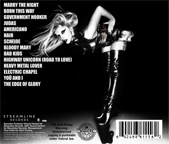
For example these CD back panels below do not feature any sequential numbering system: (Marina and the Diamonds first and second, Lady Gaga third)


Whereas on the other hand these designs do. For example the first one has numbers in a really small font to the top left of the capitalised track title:
(Lana Del Rey first, Adele second, The Wanted third)

Lana Del Rey Born To Die 2012 Music Back Cover

Here I have tested both styles on my back panel to compare:

With sequential numbering

Without numbering
After seeing these both side by side I have decided to retain the numbering system. This is because I would like to retain my simple background but still include the colour palette otherwise without the different coloured numbering it looks out of place against the rest of the Digipak and bare. I could have inserted another image of an illustration or similar but I think this will detract from the simple style I want to achieve. I also think that my target audience will prefer the contrast of colour and will catch their eye more when being looked at with a quick glance. 

Saturday, 3 November 2012

Back Panel: Design & Layout Processes

The back panel is the vital component in the Digipak as it provides track listing information, barcode for purchase and record label and copyright information. 

Firstly, I inserted a text box using my font 'Scarlett Ribbons' which I had chosen previously. I then inserted used the grid option to align it centrally onto the back panel. I then inserted the following text of my track listing:

1. Bubblegum Bitch
2. Primadonna
3. Lies
4. Homewrecker
5. Starring Role
6. The State of Dreaming
7. Power and Control
8. Living Dead
9. Teen Idle
10. Valley of the Dolls
11. Hypocrates
12. Fear and Loathing
I then coloured the numbering with the pink coral of my three point colour palette. I then scale the font to what I thought was the most appropriate text size and did not clutter the back panel. The line spacing was also important which I condensed together because then it made the text move together more and I think looked more professional.

I then added the relevant small print text which I previously discovered from my research here. I used the font Arial because the text needs to be read clearly by my target audience, especially since it will be small. I used font size 4pt and moved it to the bottom left of the back panel.

I then inserted the record label logos and barcode which I had retrieved from my previous research also. I then scaled these down using the CTRL+T tool. The following process is similar to that I have posted here from my Evaluation feedback.

Friday, 2 November 2012

Research: Record Producer Small Print Text Layout

Here, I have scanned three copied of CDs. Although my Digipak does not require a direct CD design, it is important to demonstrate the locations of information regarding recording producers. I chose these CDs:
1. Lady Gaga 'Born This Way'
2. Mariah Carey 'The Emancipation of Mimi'
3. Robert Post
I chose these because they both fit into the mainstream pop genre that my artist is involved in. However, I think that eah have their other alternative genre as well. For example, Mariah Carey is also RnB whereas Lady Gaga is also dance. So for my artist the genre is mainstream pop but also alternative pop.

In #1 it is separated into three lines. I think this is an effective way of showing this information however I do not want to spoil the main gradient I have also decided to create for the disc area.
Within #2 it features in a slightly smaller text below the bottom of the centre. In #3 it does not in fact show the record producers in the CD. However, all three include the record label logos showing it is a convention of the CD however this is not required for my digipak. Therefore #3 shows record producers is not necessarily separate from the copyright information.
#1

#2

#3
Final decision
I have decided to feature the record producer information around the CD in a circular shape. I did this by using the ellipse tool and selecting the 'shape layers' feature before I create it within my PSD. document. I followed the following tutorial to ensure that I did it correctly:


I then applied these steps to my own. Ultimately I ended up with the following result (below). I am really happy with the final outcome and feel that I have now improved upon a step from my evaluation which was to include this feature. The text is within the pink gradient of the circle. I used the cream from my colour palette to contrast with the coral pink. 


Thursday, 1 November 2012

Digipak Background Pattern: Scan & Design Process

Here is the final end design I ended up with:


For my draft I scanned a 50s fabric pattern and sharpened both the contrast and brightness to create it into a flat graphic design.  I used the magic eraser to erase all the fabric lines, especially in the white space. This enabled me to give a clear image from which to then further edit the image without any anomalies occurring on the basic and so that it can be overlayed onto another colour. I took inspiration from Marina and the Diamond's 'The Family Jewels' album where, what would be considered 'old-fashioned', a fabric had been used a reoccurring theme for the background and behind a photo image. Although it is not immediately obvious, in fact the photo image from that CD cover has been edited onto the completely separate design of the fabric during the post-editing stages. This is clear to me due to the sharp lines of the neck and chin.

Album cover I took inspiration from

Flat image of the fabric design I ended up with
STEP BY STEP GUIDE ON THE BACKGROUND DESIGN
Firstly, I copy and pasted this graphic into my Digipak PSD file and measured it up to the pink guide lines on the Digipak template [1]. Whilst selecting the layer I choose the 'Gradient Map' option. I then edit the default gradient from black to my reoccurring coral pink colour and enter than into the gradient [2]. I then right click and select 'Merge Down' so that the Gradient Map is then only effective on the fabric design, this leaves the flowers in a pink colour but the background is still white [3]. To remove this I select the option 'Darker Colour' in the drop down box on the Layers tab [4]. This removes the white and creates a dark overlay and retains the floral pattern. I then repeat this onto all three back panels ready for further individual editing.

Step [1]

Step [2]


Step [3]

Step [4]